
Felix UI
A light weight CSS component library to speed up your next awesome project
A light weight CSS component library to speed up your next awesome project
Felix UI is an open source styling framework, which helps Developers to use best styles and components, by using pre-defined classnames. Felix UI helps you to quickly build your Dream Project, by focusing much on Functionality, because we take care of your Designs.
In order to introduce Felix UI to your project, Copy the Link given below and paste it in the head tag of your html, above all other style sheets.
Felix UI comes with pre-defined colors, which are consistent in the overall design. The colors used are chosen on a generic basis, which can be accessed by pre-defined classes.
Below is the color palette, used by Felix, listed with the hex-codes.
Felix UI uses Montserrat, as its default font, which is a free font available at Google Fonts.
A Visual Type Scale - p
Paragraph - p
| Class Names | Description |
|---|---|
.text-primary |
Change font color to Primary - #3bb77e |
.text-black |
Change font color to Secondary - #2d3748 |
.text-gray |
Change font color to Gray - #626262 |
.text-success |
Change font color to Success - #20a779 |
.text-error |
Change font color to Error - #f8aa1c |
.text-warning |
Change font color to Warning - #fd4e4e |
.text-info |
Change font color to Info - #007bc3 |
.text-center |
Used to center text in a block element |
.text-w-400 |
Used for setting font weight of 400 |
.text-w-500 |
Used for setting font weight of 500 |
.text-w-600 |
Used for setting font weight of 600 |
Alerts are used to communicate a state that affects a system, feature or page.
Alerts are available in 4 different color scheme show case any system alert to users.
        Data uploaded to the server. Fire on!


        Update is ready to be installed.


        Seems your account is about to expire, upgrade now.


        There was an error processing your request!
Alerts can have extra information with description and can also have a close button.
There was an error processing your request!
Request can not be processed due to insufficient funds in account.
Avatar is used to represent a user, and displays the profile picture or initials.


The Avatar component comes in 6 sizes. check examples for better understanding.
    AT


    RE


    SK
Badges indicate status of a particular avatar.
AT
An avatar group is an element that communicates to the user that there is more than 1 person associated to an item.
        AT


        +78
Badges are used to highlight an item's status for quick recognition.
Example heading new
New
Sale
Trending
Latest
Best seller
    99+


    15


    new
Card are used to show user related data collectively, like product details.
Product card comes with Few variations. Vertical, Horizontal and Text variant for different use case.
To the product card vertical just add .vertical class to parent element.
Lorem ipsum dolor sit amet consectetur adipisicing elit. Iusto soluta, officia ipsum voluptatem laboriosam tenetur facilis illum assumenda dolorem deserunt. Facere laboriosam accusantium corrupti, repellendus ratione inventore architecto expedita aliquam!
By Nestle
Lorem ipsum dolor sit amet consectetur adipisicing elit. Iusto soluta, officia ipsum voluptatem laboriosam tenetur facilis illum assumenda dolorem deserunt. Facere laboriosam accusantium corrupti, repellendus ratione inventore architecto expedita aliquam!
By Nestle
Lorem ipsum dolor sit amet consectetur adipisicing elit. Iusto soluta, officia ipsum voluptatem laboriosam tenetur facilis illum assumenda dolorem deserunt. Facere laboriosam accusantium corrupti, repellendus ratione inventore architecto expedita aliquam!
By Nestle
Sale
Food
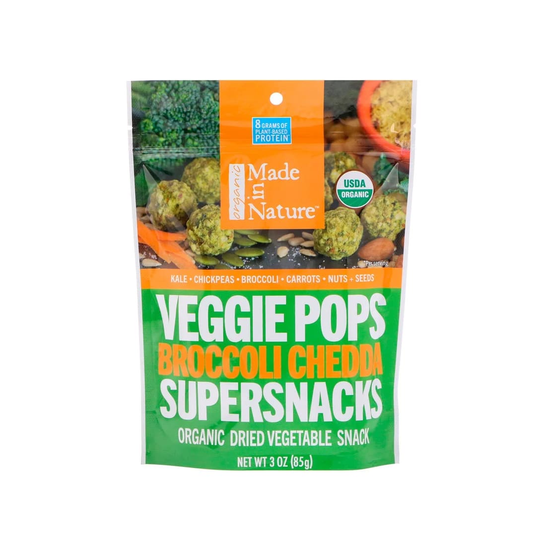
Angie’s Boomchickapop Sweet & Salty
Lorem ipsum dolor sit amet consectetur adipisicing elit. Iusto soluta, officia ipsum voluptatem laboriosam tenetur facilis illum assumenda dolorem deserunt.
By Nestle
Rs. 250
Rs. 339
To the product card horizontal just add .horizontal class to parent element.
Lorem ipsum dolor sit amet consectetur adipisicing elit. Iusto soluta, officia ipsum voluptatem laboriosam tenetur facilis illum assumenda dolorem deserunt.
By Nestle
Lorem ipsum dolor sit amet consectetur adipisicing elit. Iusto soluta, officia ipsum voluptatem laboriosam tenetur facilis illum assumenda dolorem deserunt.
By Nestle
Sale
Food
Angie’s Boomchickapop Sweet & Salty
Lorem ipsum dolor sit amet consectetur adipisicing elit. Iusto soluta, officia ipsum voluptatem laboriosam tenetur facilis illum assumenda dolorem deserunt.
By Nestle
Rs. 250
Rs. 339
To show only the text details of a product just add .text-only class in parent element to hide product images.
Lorem ipsum dolor sit amet consectetur adipisicing elit. Iusto soluta, officia ipsum voluptatem laboriosam tenetur facilis illum assumenda dolorem deserunt.
By Nestle
Lorem ipsum dolor sit amet consectetur adipisicing elit. Iusto soluta, officia ipsum voluptatem laboriosam tenetur facilis illum assumenda dolorem deserunt.
By Nestle
Sale
Food
Angie’s Boomchickapop Sweet & Salty
Lorem ipsum dolor sit amet consectetur adipisicing elit. Iusto soluta, officia ipsum voluptatem laboriosam tenetur facilis illum assumenda dolorem deserunt.
By Nestle
Rs. 250
Rs. 339
To show an overlay on a product just add a div element with .card__overlay class with desired text.
Lorem ipsum dolor sit amet consectetur adipisicing elit. Iusto soluta, officia ipsum voluptatem laboriosam tenetur facilis illum assumenda dolorem deserunt. Facere laboriosam accusantium corrupti, repellendus ratione inventore architecto expedita aliquam!
By Nestle
Lorem ipsum dolor sit amet consectetur adipisicing elit. Iusto soluta, officia ipsum voluptatem laboriosam tenetur facilis illum assumenda dolorem deserunt. Facere laboriosam accusantium corrupti, repellendus ratione inventore architecto expedita aliquam!
By Nestle
Lorem ipsum dolor sit amet consectetur adipisicing elit. Iusto soluta, officia ipsum voluptatem laboriosam tenetur facilis illum assumenda dolorem deserunt. Facere laboriosam accusantium corrupti, repellendus ratione inventore architecto expedita aliquam!
By Nestle
Sale
Food
Angie’s Boomchickapop Sweet & Salty
Lorem ipsum dolor sit amet consectetur adipisicing elit. Iusto soluta, officia ipsum voluptatem laboriosam tenetur facilis illum assumenda dolorem deserunt.
By Nestle
Rs. 250
Rs. 339
Sale
Food
Angie’s Boomchickapop Sweet & Salty
Lorem ipsum dolor sit amet consectetur adipisicing elit. Iusto soluta, officia ipsum voluptatem laboriosam tenetur facilis illum assumenda dolorem deserunt.
By Nestle
Rs. 250
Rs. 339
Use grid when you want to divide screen width into column. Check below some examples of side by side cards.
To create a two colum grid add .grid class to parent container div and arrange it according to your need with below utility classes.
col-2-even : To evenly divide a row into 2 columns.col-2-right-expand : To divide a row into 2 columns where right column is stretched.col-2-left-expand : To divide a row into 2 columns where left column is stretched.
To create a three colum grid add .grid class to parent container div and arrange it according to your need with below utility classes.
col-3-even : To evenly divide a row into 3 columns.col-3-right-expand : To divide a row into 3 columns where right column is stretched.col-3-mid-expand : To divide a row into 3 columns where middle column is stretched.col-3-left-expand : To divide a row into 3 columns where left column is stretched.
Felix UI comes with few utility classes for images for different purpose.
Images in Felix UI are made responsive with .img-fluid. This applies max-width: 100%; and height: auto; to the image so that it scales with the parent width.


The input is used to get user input in a text field.
Inputs need to be validated before getting processed in the system. so input comes with validation messages for better user experience
Username is not valid
Lists can be used at so many places, navigation bar, stacked notifications, article pages, etc.
| Class Names | Description |
|---|---|
list-style-disc |
To add disc style for ul list items. |
list-style-square |
To add square style for ul list items. |
list-style-circle |
To add circle style for ul list item. |
list-style-number |
To add number style for ol list item. |
list-style-lowerLetter |
To add lower case letter style for ol list item. |
list-style-upperLetter |
To add Upper case letter style for ol list item. |
    {list items...}


    {list items...}


    {list items...}


    {list items...}


    {list items...}


    {list items...}
To strip away any list styling, add list-style-none class to stack items without any default list styles.
user added
@new-user just folowed youuser added
@new-user just folowed youuser added
@new-user just folowed youuser added
@new-user just folowed you
-
user added
@new-user just folowed you
-
user added
@new-user just folowed you
-
user added
@new-user just folowed you
-
user added
@new-user just folowed you
Modals are positioned over everything else in the document and remove scroll from the page. It gets closed only with close button on modal pop-up.
Click on the below CTA to open modal. Once the modal is open user will not be able to scroll or do any action on the main page. To close the pop-up, click on close icon or Back button. Functionality is achieved using JavaScript
// Get the modal
var modal = document.getElementById("myModal");

// Get the button that opens the modal
var btn = document.getElementById("myBtn");

// Get the span element that closes the modal
var span = document.getElementsByClassName("close")[0];

// When the user clicks the button, open the modal
btn.onclick = ()=> {
    modal.style.display = "block"
    document.body.style.overflow = "hidden"
}

// When the user clicks on (x), close the modal
span.onclick = ()=> {
    modal.style.display = "none"
    document.body.style.overflow = "visible"
}

// When the user clicks anywhere outside of the modal, close it
window.onclick = (event)=> {
    if (event.target == modal) {
        modal.style.display = "none"
        document.body.style.overflow = "visible"
    }
}
Rating components can be used as read-only badge or in reviews section. Can be used in reviews section as form too.
This component can be used for toast or snackbar component. Toast is mostly used to show feedback message. Snackbar is to used show message that need user action
Saved!
Please fill the form!
Saving to server...
Try again later!
Sliders are used to decide range for something like sound in videos, price in shopping sites, etc.
const range = document.querySelector(".range")
const thumb = document.querySelector(".thumb")
const track = document.querySelector(".track-inner")

const updateSlider = (value) => {
    thumb.style.left = `${value}%`
    thumb.style.transform = `translate(-${value}%, -50%)`
    track.style.width = `${value}%`
}

range.oninput = (e) => updateSlider(e.target.value)

updateSlider(50)